
Start With the Site, Not the Sample
Before picking a colour, look at where the deck will sit. A shaded courtyard in Cape Town will behave differently from an open rooftop in Durban or a pool edge in Somerset West. Full sun, reflected light from paving, and nearby walls all change how a deck tone reads once it is installed.
In practical terms, darker colours absorb more heat and can feel hotter underfoot on exposed areas. Lighter tones bounce back more light, which can help in tight spaces or where you want the area to feel calmer. If the deck is for a family braai area, a retirement village walkway, or a shop frontage, think about foot traffic, cleaning, and how much dust or sand will show.
- Open, sunny sites usually suit mid to light tones.
- Shaded areas can take deeper colours without feeling too heavy.
- Coastal sites often benefit from colours that hide salt marks and general weathering better.
Match the Colour to the Purpose of the Space
Decking and benches are not only visual features. They are working surfaces, so the colour should support how the area is used. A restaurant terrace in Stellenbosch may want a neat, neutral tone that sits behind the furniture. A school or public seating area in Bellville may need a colour that hides scuffs and keeps the space looking tidy between cleans.
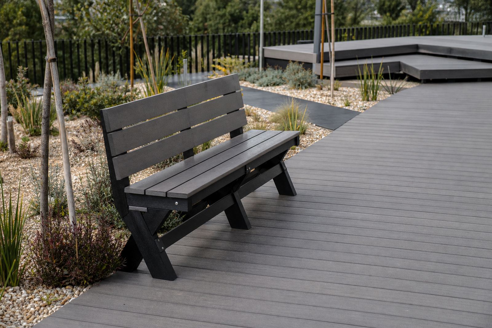
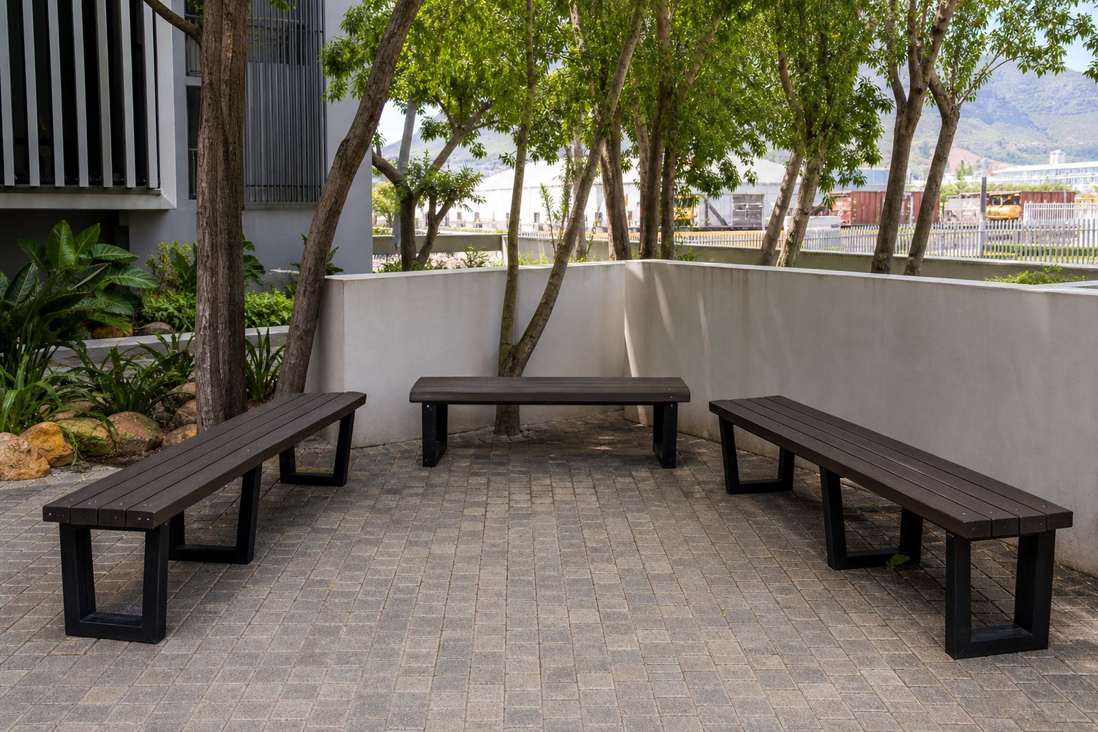
Bench colour matters as much as decking colour because the eye reads them together. If the bench is a different shade from the deck, make sure the difference is deliberate. A little contrast can help define seating zones, while close matching tones can make the whole area feel more unified.
- For hospitality spaces, choose colours that support the furniture and shade structures.
- For residential courtyards, softer earthy tones usually age well in appearance.
- For public areas, choose practical colours that cope with heavy use and regular washing.
Think About Heat, Glare and Bare Feet
Colour choice is not just about looks. On exposed decks, especially in Johannesburg and inland areas with strong afternoon sun, the wrong tone can make a surface uncomfortable to walk on with bare feet. Very dark shades can feel hotter, while very pale shades can create glare in bright light. The best choice is often somewhere in the middle.
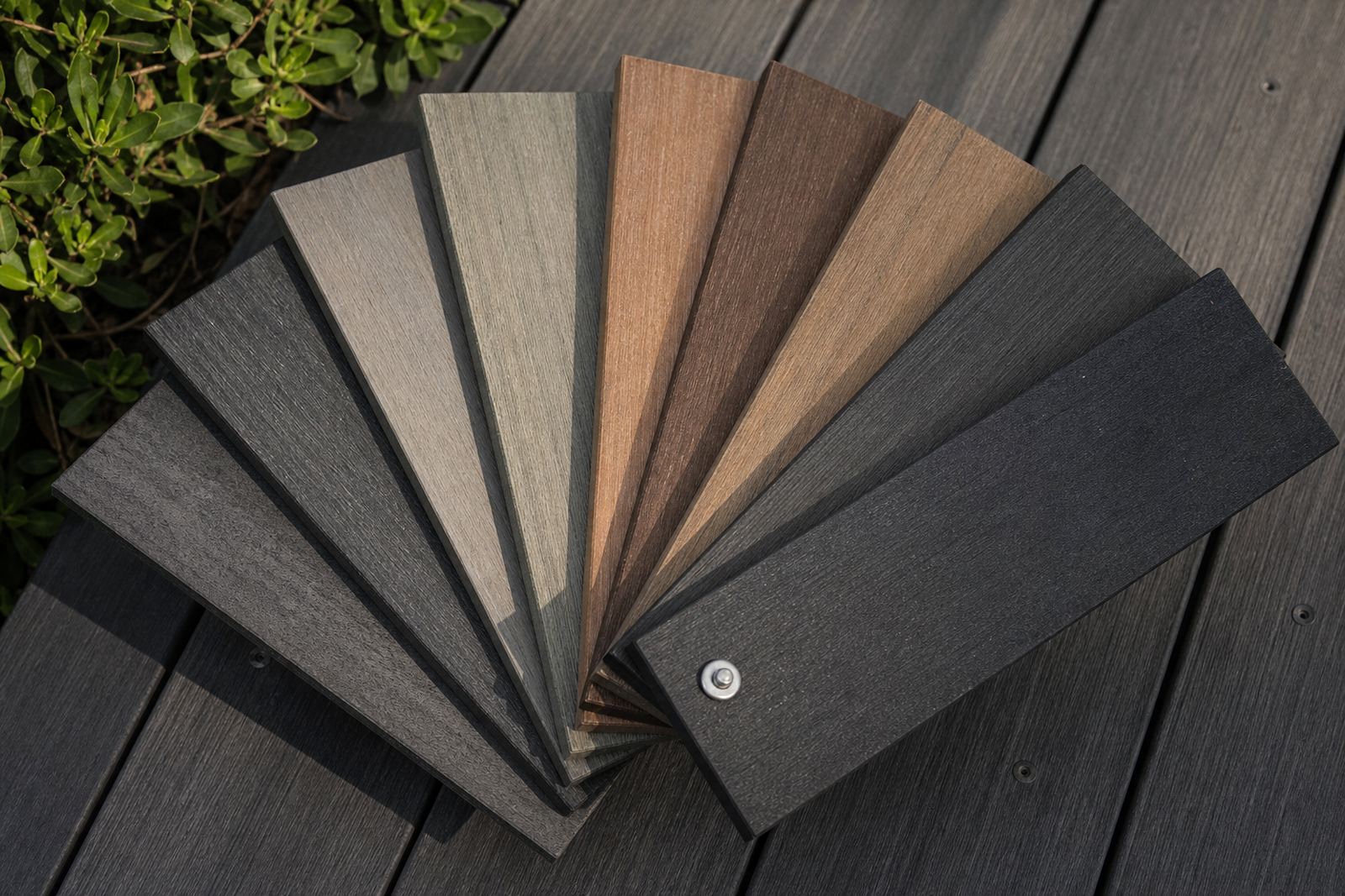
If the deck will be used around a pool, in a courtyard, or on a patio that gets direct sun for most of the day, ask how the colour behaves in heat. A middle brown, weathered grey or muted earth tone is often easier to live with than a very dark or very bright option. It is worth being carefull here, because the colour that looks best on a small sample can feel very different across a full deck.
- Dark tones suit shaded or partially covered areas.
- Mid tones work well for mixed sun and shade.
- Very light colours can show dirt more easily in busy spaces.
Use Local Conditions to Narrow the Palette
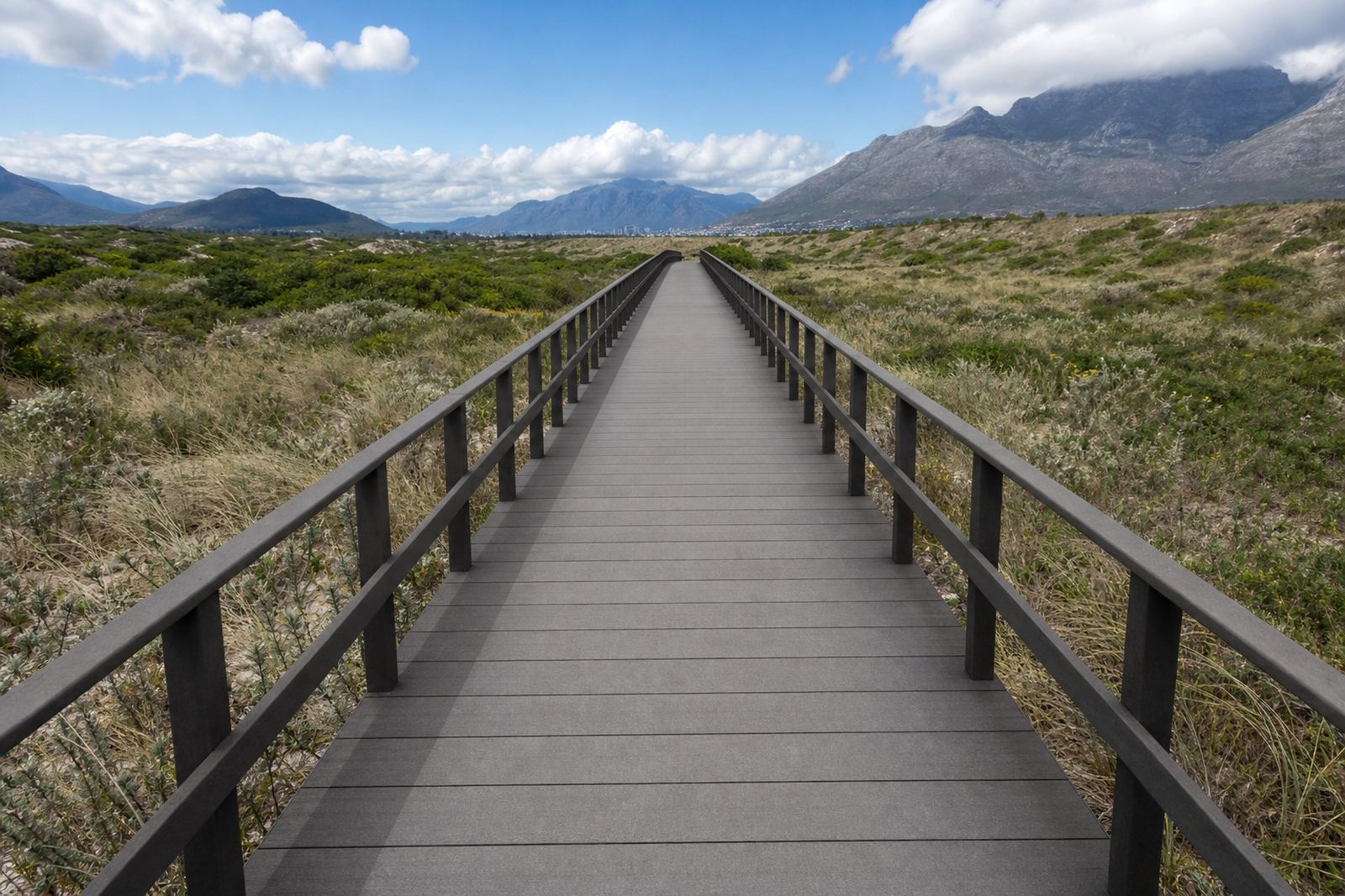
South African sites are not all the same, and the colour choice should reflect that. In coastal towns like Cape Town, George and Durban, the air can carry salt and moisture, so a practical colour is one that does not look tired after a few weeks of wind-blown grime. Inland, dust and stronger sun are usually the bigger concerns, especially on long walkways and entertainment areas.
A local example helps. A homeowner in Paarden Eiland might choose a medium grey deck with matching benches for a neat, low-fuss finish near the water. That same tone may also suit a commercial property in Paarl where the owner wants the area to stay orderly without constant wiping down. The point is not to chase a trend, but to choose a colour that suits the site and the way people move through it.
- Coastal areas: practical mid tones that handle salt air and frequent cleaning.
- Inland areas: colours that cope with strong sun and dust.
- High-use areas: shades that hide scuffing and everyday marks.
Coordinate Deck Boards and Benches Without Making Them Identical
Decks and benches do not have to match exactly to look good. In fact, a slight shift in tone can give the space depth. A darker deck with lighter benches can make the seating stand out, while a near-match creates a calm, steady look. The right balance depends on the building, the paving, and the type of outdoor furniture already in place.
For a townhouse courtyard in Somerset West, a warm grey deck with charcoal edging and matching benches can feel tidy without looking severe. For a family garden in George, a wood-look brown with slightly darker bench components may blend better with planting and boundary walls. The trick is to keep the colours intentional, not accidental.
- Use contrast to highlight seating zones.
- Use close tones for a softer, more uniform result.
- Check the colour next to walls, balustrades and paving, not on its own.
Ask How the Finish Will Age in Real Use
Recycled plastic lumber is chosen for low maintenance, but the colour still needs to suit real life. Over time, outdoor surfaces pick up dust, footprints, irrigation splash and general wear. Some tones make that less visible than others. If a deck is for a rental property, a guest area or a commercial entrance, a practical colour can save time on upkeep and keep the space looking cared for.
It also helps to think about how the finish will sit with maintenance routines. Will the area be washed weekly, or only after heavy weather? Will leaves collect around the edges? Will there be moving furniture on the surface? These questions matter as much as the shade itself, because the best colour is the one that still looks right after everyday use. That is the part people often miss when they choose from a small offcut.
- Choose tones that hide dust, water marks and foot traffic.
- Keep maintenance habits in mind when comparing shades.
- Look at the colour in morning light and late afternoon light before deciding.
A Simple Way to Decide Before Ordering
If you are still unsure, narrow the choice to two or three colours and test them against the site. Look at them beside the walls, the paving and any existing timber or metal features. Step back from the area and imagine the space in summer, not just on a cool morning. That is usually when the right option becomes obvious.
For trade projects, the best results often come from matching the colour to the use of the space rather than trying to make it the star of the show. A good deck colour should support the setting, not fight it. Once that is clear, the benches and edging can be chosen to complete the look without overcomplicating the job.
If you are planning recycled plastic lumber decking or benches across Cape Town, Stellenbosch, George, Johannesburg or Durban, start with the site conditions, then choose the tone that will stay practical for years. The neatest-looking job is often the one that was thought through carefully at the start.